
Stock Charts Can Be Misleading To The Novice Chart Reader
 When talking about the stock market, most financial advisors like to use charts to illustrate the past behaviour of the stock markets. Charts are a great vehicle to show how volatile the stock market can be year to year, and they also show the long-term returns of various stock markets. One such chart is called the “Morningstar Andex Chart”. There is a great deal of valuable information on this chart including past periods of inflation, recessions, interest rates, etc. However, the main information on this chart is past performance of the stock markets around the world. Long lines that stretch the length of the document from left to right represent the returns. Advisors use this tool to illustrate how the markets have performed in the past, especially to the novice investor. However, this chart can be deceiving if you don’t read it properly.
When you first observe the Andex Chart, it seems that the markets go up smoothly with small drops here and there, but all of us know that this is not the case. Markets can drop by as much as 50% (circa 2008-2009), but by looking at the chart, it looks like a small decline. The reason is that this chart is what we call a “logarithmic chart” instead of a “linear chart.”
If you look at the numbers on the Andex Chart, the solid coloured lines represent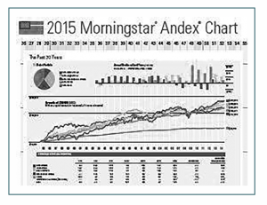 how the value of $100 has progressed in various markets since 1950. Let’s assume that we bought the markets for $100 in 1950. The $100 became $1,000 at around 1970. The distance on the chart between the $100 point and the $1,000 point (you see these values at the left-hand side of the chart) is about 3cm. Now let’s look at the chart between $1000 and $10,000. The distance between these values is also about 3cm. When you look at the distance between $10,000 and $50,000 it is only about 2 cm. So, let’s assume that our $100 became $50,000. If the $50,000 went down by 50% to $25,000, this loss would be represented by a 1 cm drop on the chart which is hardly visible when you look at the entire chart. This is where it becomes misleading. If you look at the lines on or around 2008-2009, most markets did drop by 50%, and yet the chart fails to show this dramatic drop to the novice chart reader.
If you want to see how the markets have progressed over the years, it’s best to look at a “linear chart”. This chart shows a complete picture of how the markets have behaved over the years in real numbers. It gives you a realistic sense of 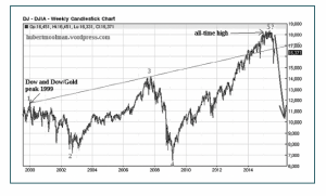 how volatile the markets can be. The chart I have included covers the period between 2000 and 2017. Observe the Andex Chart over the same period. It looks far less dramatic than the linear chart.
The Andex Chart is a tool which I have used with my clients as well and the other data on it is very useful and interesting. However, if an advisor is showing it to you, it’s important they explain why it looks so “smooth” and to show you a linear graph as well.
John Kalos, CFP, Fin.Pl. is an independent Certified Financial Planner (CFP) at IRONSHIELD Financial Planning. He is also the founder of "Confessions of an Ex-Banker" Podcast which can be downloaded on iTunes. He can be reached at johnkalos@ironshield.ca