Inflation Or Deflation: Which Is Best For Your Portfolio?
 There is often a divide among Canadian investors. Some prefer gold, silver and energy where others are more comfortable with banks, utilities and technology. There is a season that supports each group of investments. It is all about understanding the drivers of each phase.
Let’s take inflation. Some of the prime markers for a cycle in inflation are:
- A weak or declining U.S. dollar (most important).
- Shorter business cycles. The average is about 4-5 years.
- Steady rising inflation.
- Commodities begin to steadily outperform stock indexes (i.e. S&P 500, Dow Jones Industrial Average, etc).
The most recent example of this was in 2000 to 2012. Gold, (the most sensitive commodity to inflationary pressures), moved up 500%. Silver had an even bigger movement. The precious metals roared up over 750% 2004 to the blow-out top at 2011. Light crude oil (WTI) rose over 360% from 2003 to 2008 and copper jumped almost 300% from 2003 to 2006. Many other commodities had near equal performance during the 2000s. And during that decade, the U.S. dollar dropped 40% in value.
Banks, utilities and technology sectors did all right during the 2000s decade with an average performance of about 90% over 10 years. This movement was nothing compared to the movement of the inflationary sectors.
Deflation has a different set of markers.
- There is a stable and rising U.S. dollar (the dollar rose 25% since 2012).
- Stock market corrections are typically short in duration and shallow.
- Inflationary pressures are well contained with inflation staying around 2%. There are several other secondary signals such as extended bull markets and business cycles (more on this item later in this article) and of course, deflationary assets outperformed inflationary.
The example best comes to life when we examine the Dow Jones Industrial Average and the Commodities Research Bureau Index (CRB) after 2012. From 2012 to 2019, the S&P 500 rose 116% whereas the CRB fell 52%.
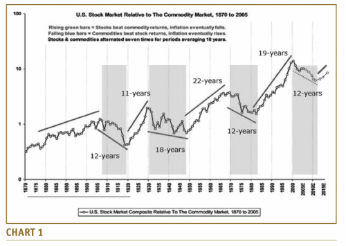
When we examine the market cycles over the last century, it becomes clear that there are distinct periods when one asset group is outperforming the other.
On the next page is a chart built for a client in 2005 and then updated in 2015. Since 1910, approximately every 18 years, one asset group dramatically outperforms the other group. The shaded areas indicate when the CRB was outperforming the Dow Jones Industrial Average (Dow) and the clear areas show the opposite (Chart 1).

The chart shows that performance from one asset group over the other is cyclical. It is based on a number of economic factors, but one of the guiding gauge is the U.S. dollar. A rising dollar is deflationary whereas a declining dollar is inflationary.
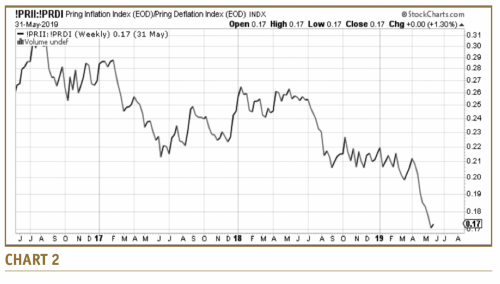
Martin Pring created two indexes that helps define and track inflationary and deflationary pressures. They are offered on StockCharts.com. The symbols are !PRII for the inflationary index and !PRDI for the deflationary index. To find out which asset group has the strongest relative performance, simple use !PRII:!PRDI as the StockCharts.com symbol or name. I would suggest using weekly data putting the chart in solid line format. Also, use a three year time period, or longer. The results will look like Chart 2.

Over the last 3 years, the line has gone straight down, meaning deflationary sectors are outperforming inflationary sectors. In fact, that has been the general direction since 2012.
Bottom line: The dominance of one asset group over the other lasts an average of 18 years. This has been the pattern for over a hundred years. Deflationary assets are now in that lead position. They have been there since 2012. That suggests that deflationary assets should continue to generally outperform commodities for another decade.
Donald W. Dony, FCSI, MFTA. Analyst, past instructor for the Canadian Securities Institute (CSI), editor for the www.technicalspeculator.com, dwdony@shaw.ca.


